Rebranding a Department: Interactive Design Proposal
In Spring 2023, as part of Vanessa Cannon’s branding course, I was tasked with reimagining the brand identity of my department, Emerging Technology in Business Design (ETBD). The challenge: update an identity that felt vague and misaligned with the bold, innovative spirit of our students.
The result was a comprehensive rebrand proposal, including a new name, logos, brand marks, typography, color palette, and collateral that better reflected the collaborative, creative, and future-focused culture of the department.
Project Overview

The existing department name, Emerging Technology in Business + Design (ETBD), was:
Long-winded and difficult to explain in interviews.
Vague, lacking clarity about what the program offered.
Misaligned with student pride and identity.
Students often found themselves explaining ETBD instead of confidently stating what they studied. This gap signaled the need for a more cohesive, approachable, and modern identity.
The Problem
1. Research & Discovery
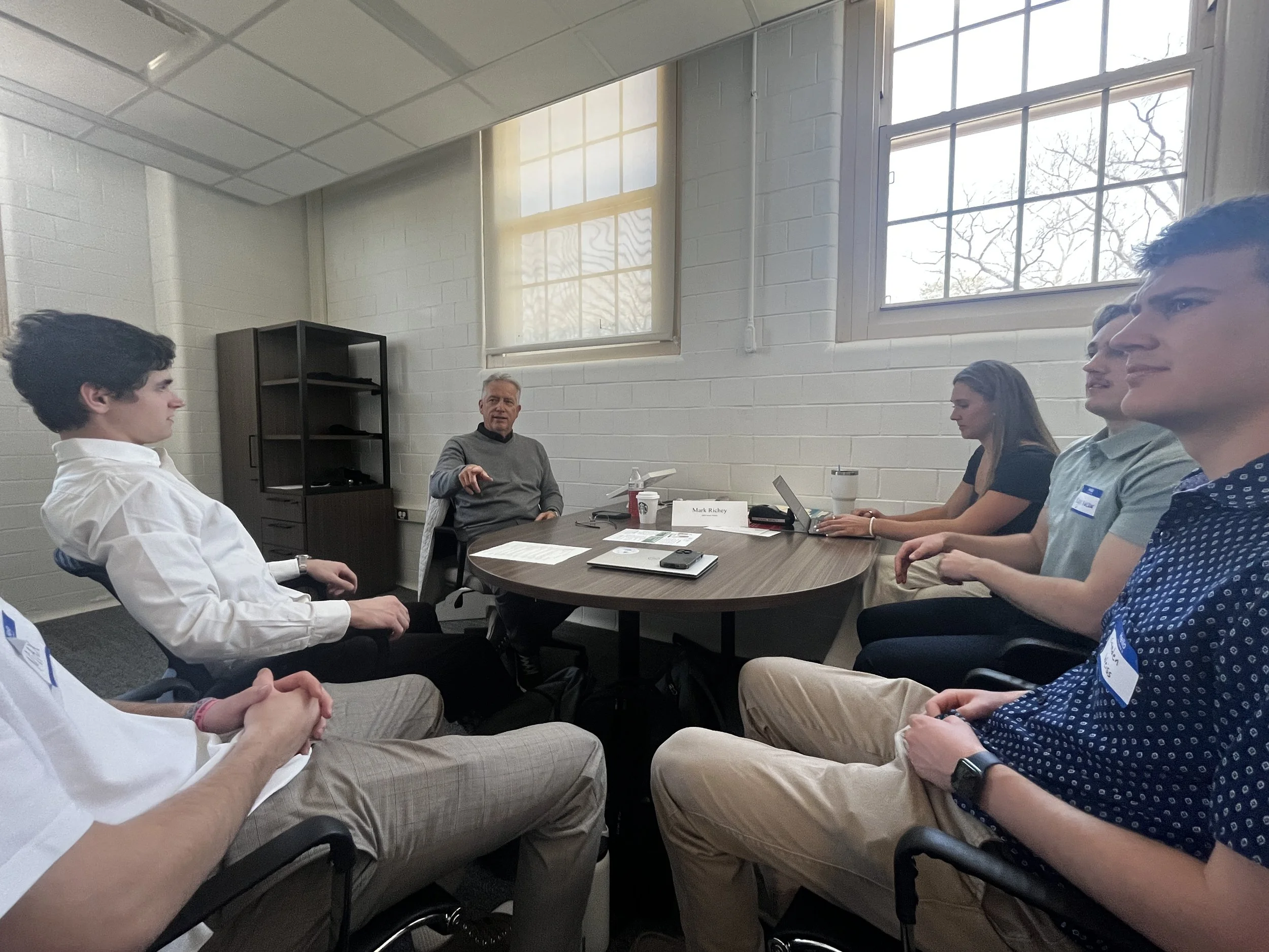
Interviewed 10 students across three cohorts (Coding, Design, Entertainment/Motion).
Identified recurring pain points: unclear branding, lack of departmental identity, and weak external recognition.
2. Moodboards & Inspiration
Built cohort-specific moodboards highlighting colors, symbols, and visual artifacts unique to each track.
Used color theory to unify the three sections under a common palette.
3. Ideation & Iteration
Sketched multiple logo concepts tying together “Interactive” and “Design.”
Integrated key artifacts (brackets, cameras, controllers, sprites) to symbolize each sub-track.
Designed a system of patterns and marks, akin to a “house system,” allowing students to showcase their identity within the larger program.
4. Validation
Shared concepts with multiple students for feedback.
Iterated on logos and marks until the designs resonated with the student body.
The Process

New Department Name:
Interactive Design — simple, clear, and true to the program’s spirit.
Deliverables:
Primary & Secondary Logos – embodying the “I” and “D” while hiding playful symbols.
Cohort Brand Marks – visual identities for Branding, Entertainment, and Games, tied together through consistent shapes and color theory.
Color Palette – modern yet meaningful hues (red, blue, gold, grey, silver).
Typography – Hauschka Rounded (approachable strength) + SF Pro Rounded (modern recognition).
Applications – business cards, social media mockups, signs, and stickers.
Final Deliverables
Though this was a proposal project, it sparked valuable conversations:
Students felt the rebrand reflected their passions and were excited by the identity.
Professors noted how the cohesion and clarity could help both recruiting and external recognition.
Personally, the project became the catalyst for founding BuzzBrand, where I continue to do identity design work for real startups.
Rebranding “ETBD” into Interactive Design taught me how to blend research, creative direction, and stakeholder validation into a brand identity that not only looks good but fosters pride and recognition. More than just a class project, it was the spark that turned my interest in branding into a real-world venture.


